Histopath
Rebrand
Histopath is the largest independent provider of specialist diagnostic services in Sydney. They are a pathologist specialising in histology, the study of skin tissues under the microscope. Seeking a rebrand, their vision was to be acknowledged as a global leader in advancing patient outcomes through diagnostic innovation.
This brand concept focuses on the tension between micro and macro perspectives. In a technical and curious approach inspired by microscopic lenses, this direction is all about pulling focus to the areas that matter. The theme centres on magnification, scale, and employs design hierarchy, aligning with the expectations of patients and doctors. It underscores the importance of considering intricate details under the microscope while maintaining a broader view of patient well-being.
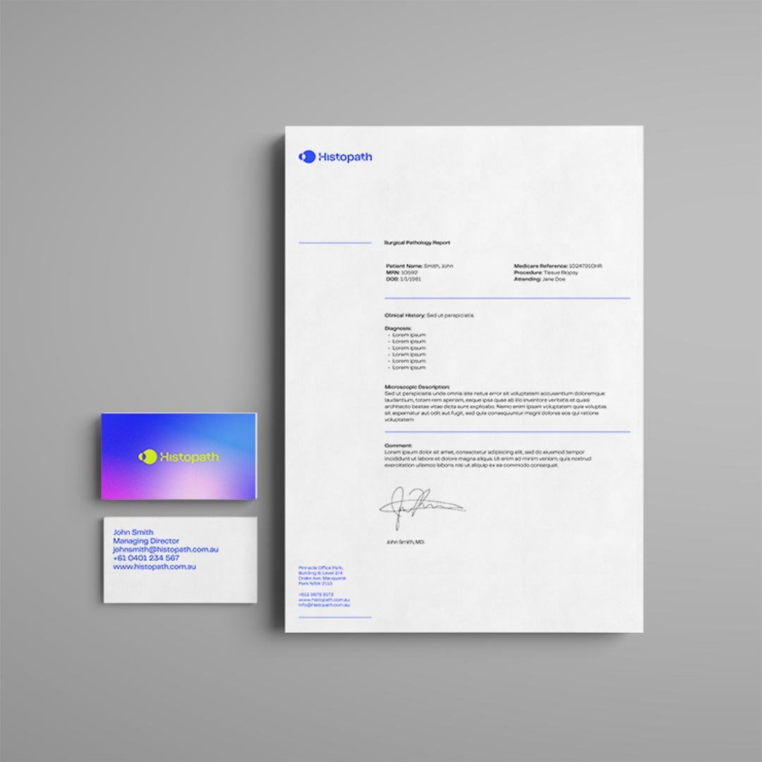
The logo creatively captures the spirit of a microscope—pulling focus between two forms to create a clear point of precision. The wordmark incorporates subtle twists and soft curves in certain letters, symbolising DNA and reflecting Histopath's patient-centric approach and compassionate touch.
The design system integrates 3D microscopic lens assets and abstract stills derived from the animated logo, serving as framing devices for photography. The colour palette pays homage to Hematoxylin and Eosin stains synonymous with histology, while subtly nodding to the technological aspirations embedded in the new brand.