Redcape
rebrand
Redcape, a prominent hospitality group with a strong presence in pub operations along Australia's east coast, engaged us in a rebranding initiative. Their shift from a consumer-focused identity to an emphasis on their workforce prompted this transformation.
The core of Redcape's success lies in their distinctive work methodology, code, and culture, with a keen focus on the impact on the communities they serve. Our design approach distilled these aspects into a guiding principle; Matter and Manner, serving as the cornerstone for the revamped brand.
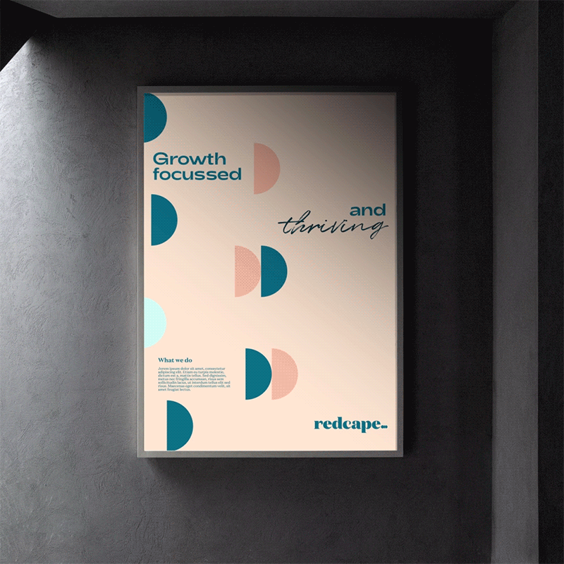
The central element of the rebrand is a wordmark that exudes clarity, warmth, and a welcoming demeanour, embodying the brand's bold and inventive personality. Complementing this is a dynamic motion mark, symbolising momentum and a continuous reverberation reaching into the communities touched by Redcape, a punctuation mark that refuses to fully come to a halt.
Given the employee-centric nature of the brand, we elevated the human touch and individual personalities integral to Redcape. A thoughtfully curated colour palette and typographic combinations were employed to emphasise the human warmth, featuring hero pastel tones grounded by confident teal shades. The incorporation of a handwritten font and hand-drawn elements in headlines adds a layer of dynamism, highlighting the most human aspects while ensuring legibility, credibility, and functionality remain paramount.